Dark Side
Dark Side
____________________________________________________________________________________

Inspired by the questions Elisa Devis asked on Twitter a few days ago (I am honored by her words) to me and Luke Abraham, I decided to write this post.
I hope you find it interesting and not very convoluted, I'm terrible at explaining my processes in words!
Dark Vs.Light
Granted that 90% of the time I start a Viz in dark mode, sometimes I try to change games and initially I try in light mode. Irene Diomi knows something about it, in our collaboration project I will have shared dozens of light Viz with him but in the end I always opted for the dark mode.
Looking at my profile, the non-dark view that gave me the most satisfaction is this.
Here are two of my Viz that were originally born with a light background but eventually became a dark background.
The first concerns the Diversity project on. The dataset is composed of the classification of the mice 100 billionaires. My message is to address the gender gap.
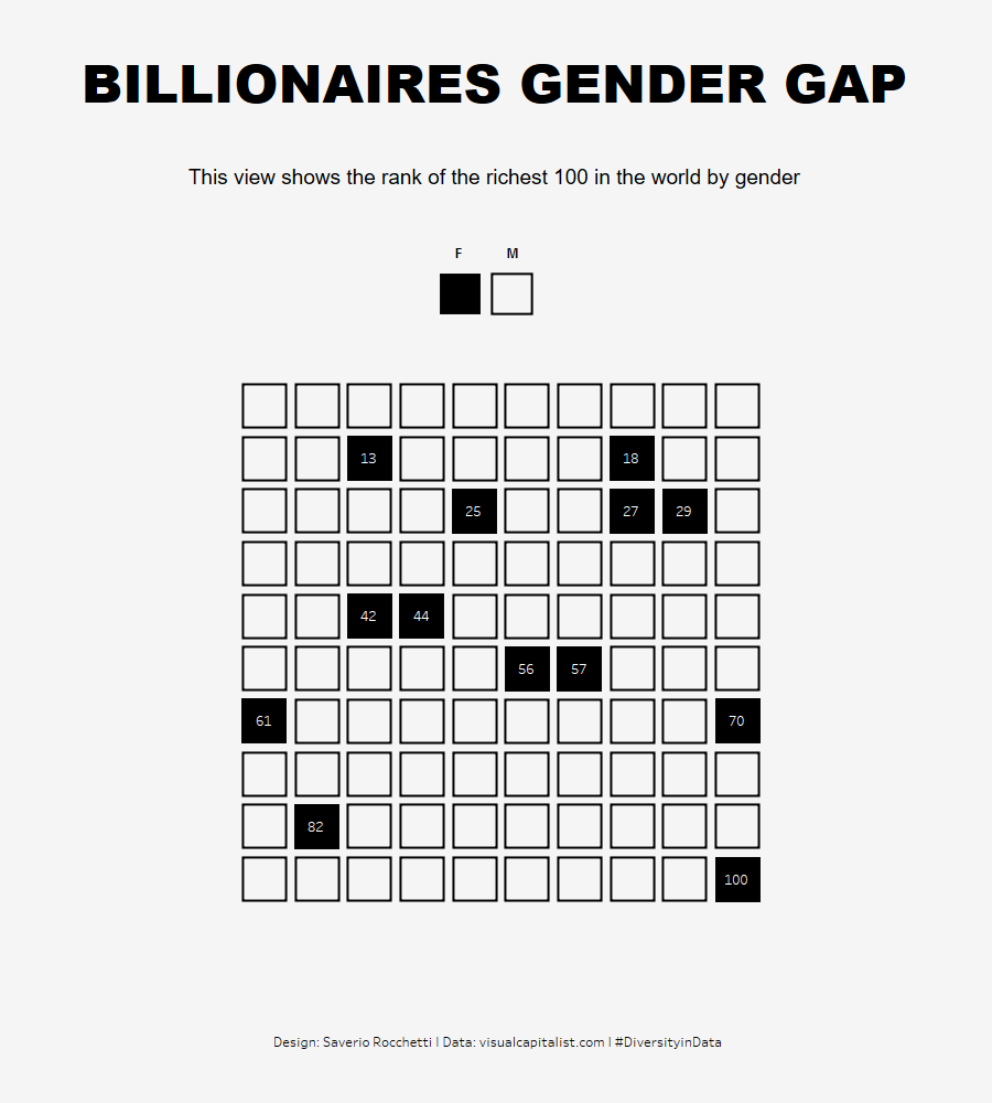

https://tabsoft.co/3hzJnwE
The second concerns the BACK 2 VIZ BASICS project. The dataset People's acceptance of homosexuality in different states. My goal, to show the gap between acceptance and not.
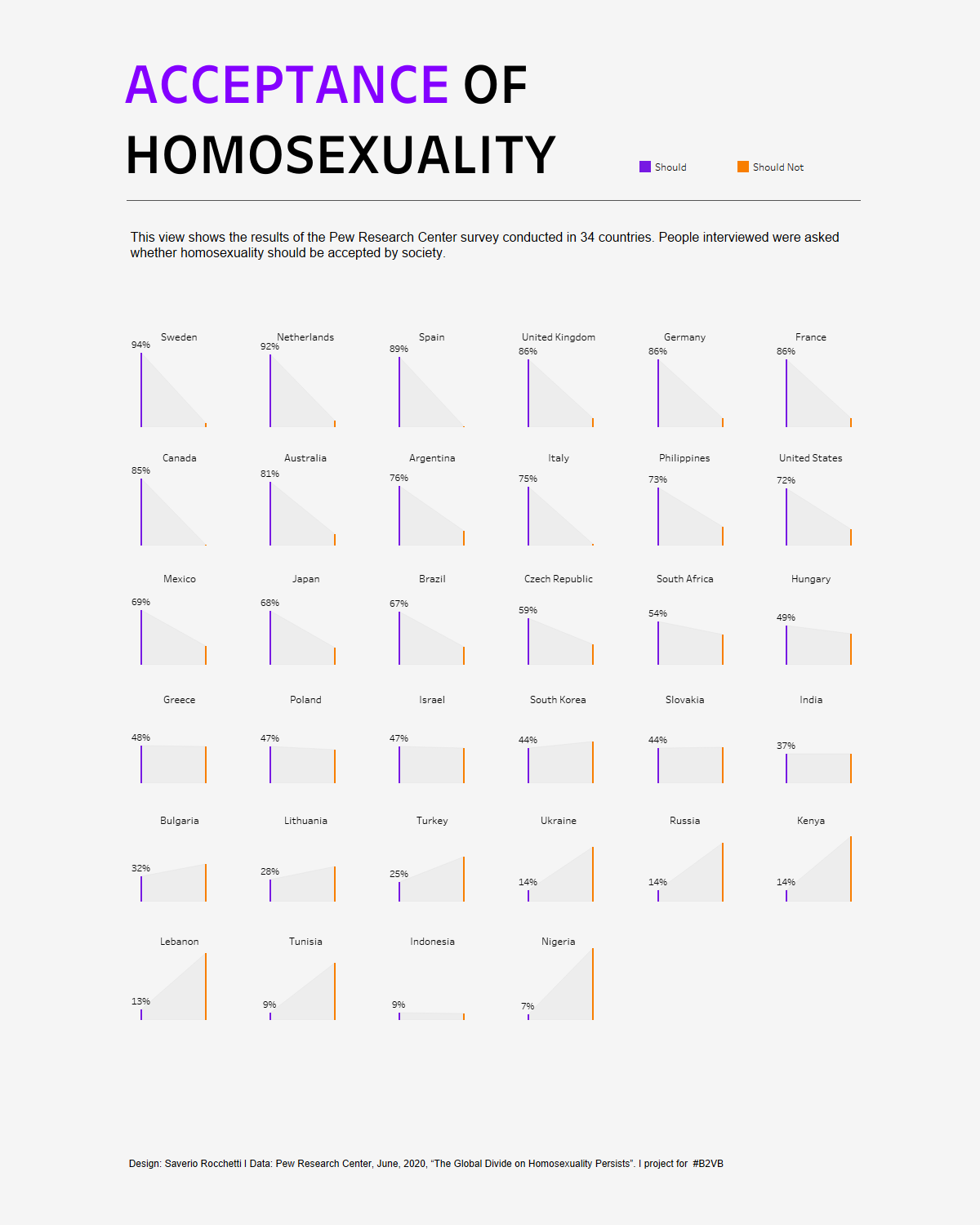
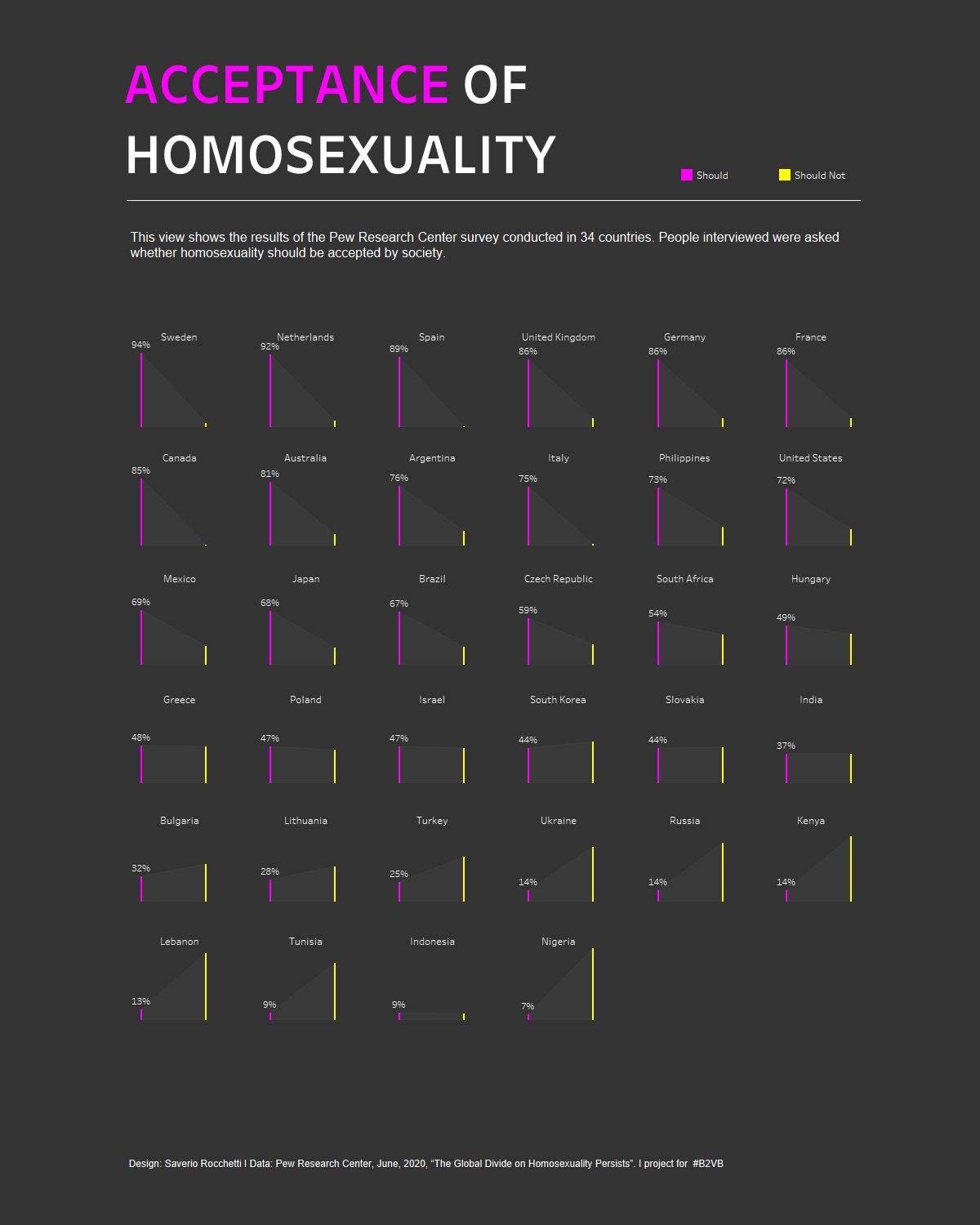
https://tabsoft.co/3EoD7kh
What black do I use? How do I think about the contrast? How do I choose the colors? What about the font size?
I usually use the second or third of the tableau color chart. I usually use the second or third of the tableau color chart. I think the second a lot more often.
Sometimes even a custom black for example using figma to create a background image.
Contrast and color palette
I combine these two aspects because when I design a viz I think of them as one. I think choosing these two aspects is the most difficult challenge when choosing to design in dark mode. Sometimes I am forced to change the type of graphic to ensure that contrast and colors convey a clear message that can be immediately understood by the reader.
I admit I've always been attracted to Pop colors on a black background since I was a child. Even now when I go to museums or art exhibitions (I love to do it) my eyes are captured by everything that has a dark background and bright colors on it, this is also the case when I buy a T-shirt.
But back to the Viz …
In the past I have created visualizations with many colors (even more than 4). Over time, however, I began to reduce all this, most of my works have one or two colors at most. One color to convey the message is the best for me.
Mostly I like to use purple, yellow, green and blue. Brilliant,obviously.
Most of the time I let myself be guided by my eyes to understand if the contrast works but I also use some excellent resources on the net to check the contrast for example these that were kindly shared by Sarha Barlett.
Contrast:
https://webaim.org/resources/contrastchecker/
Color Palette generation:
Tips for a quick build in Tableau - since the default text and axis colors are all Black #3 how do you build on black without losing your mind in the formatting section?
Not an answer or advice, I can say how I do that is to remove everything! Lines, axes etc. then I only insert what my graphic designer needs.
Who inspires YOU? What are some (data and non-data) designers we could look up to?
Difficult to list them all. I choose to mention two, for one simple reason, the works of these two authors as well as being a strong inspiration, convinced me to join this community more than two years ago. When I looked at them it was just WOW !! And from there I landed on Twitter to start my adventure.
CJ Mayes
Although he has recently abandoned his dark side ahaha! His dark background views are just great, contrast and colors used, so much stuff!
I recommend you take a look at his profile, which is really impressive
https://public.tableau.com/app/profile/cj.mayes
This is my favorite!

Priya Padham
Priya is truly a delicious person, I was lucky enough to have a chat with her a while ago! I think the visualizations of her are of a unique elegance. I love her style.
Be sure to check out her profile!
https://public.tableau.com/app/profile/p.padham#!/
This is my favorite!
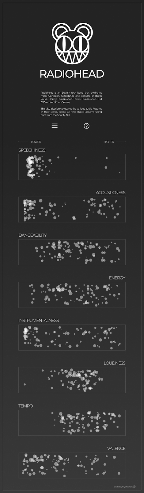
https://public.tableau.com/app/profile/p.padham/viz/Radiohead_15924804893410/Radiohead
Finish!
Comments
Post a Comment